Add the Navigation Bar to the Homepage
Our homepage still lacks the navigation bar at the top of the page. In this exercise we will add the navigation bar without any styling.
The navigation bar needs to span the full width of the browser window.
At the left side we need the hamburger menu, that needs to open a navigation menu when we click on it. At the right side we need the user menu that allows the user to logout or to modify his profile settings.
Using the Chrome Developer Tools to ‘Borrow’ a Design
In exercise 5 we introduced the developer tools as a good means to ‘borrow’ ideas from other web sites. On the other pages of the Self Service Portal (New Request, My Inbox, …) we have already a navigation bar at the top of the page, so let’s have a look and try to ‘borrow’ the design.
In Chrome, log in to GlobalNet as frederic.anderson@globalnet.com and go to https://globalnet.4me-demo.com/self-service/inbox.
Open the developer tools (keyboard shortcuts: Ctrl Shift I or Cmd Option I). Click on the icon for the Element Inspector:
![]()
Next, click somewhere in the middle of the navigation bar.
Question:
Describe the HTML structure of the navigation bar in the top header bar of the inbox view of the Self Service.

The navigation bar element div.global-header is contained within a div.global-header-inner-container, which is itself contained within a div.global-header-outer-container.
Exercise:
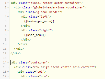
Copy the HTML design for the navigation bar element that you have found via the developer tools to the Homepage.
This is the HTML you need to add to the Homepage HTML. Make sure this HTML is defined before the container you defined in the previous exercises:

Using the Chrome Developer Tools to Overwrite a Style
The navigation bar in the top header of the homepage should span the full width of the browser window. When you open the Self Service Portal Homepage on a large screen (for example with a horizontal resolution of > 1600 pixels), you will see that this is not the case.
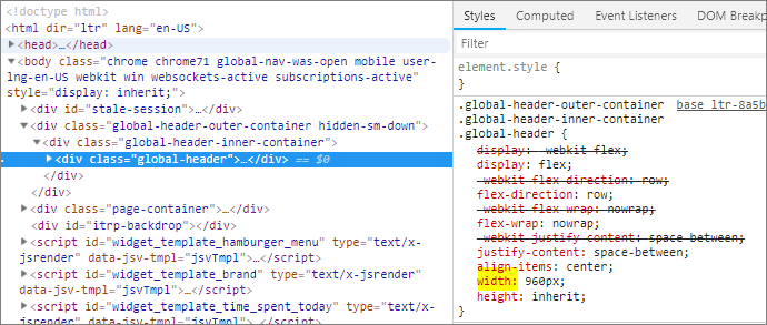
Let’s find out why. Open the developer tools again and select the div.global-header-inner-container. Check the css rules that are applied on this lement via the Styles page. You will find a max-width property of 960px. Then select with the element inspector the div.global-header element: you will find a css rule on the Styles page that sets the width property also on 960px:

That’s what happens when you borrow a design, you get the Xurrent out-of-the box styling as an extra gift. To meet the requirement you will need to overwrite some of the standard Xurrent css rules for the navigation bar.
Exercise:
Add the css to make sure that the navigation bar in the top header of the homepage spans the full width of the browser window.
This is the CSS you need to add to the Homepage CSS (you only want this behavior on the homepage, on the other pages the navigation bar still needs a maximum width of 960px):

You now have a top header with a toolbar with the hamburger menu at the left side and the user menu at the right side. When you click on The user menu, you can edit the user profile or logout. And obviously we still need to style the homepage and the top header navigation bar. But before we do the styling, we need to resolve an issue with the hamburger menu: when you click on it, nothing happens. In the next exercise we will explain why.
