Add the Drop-down Menu
In the previous exercise you discovered that adding the hamburger_menu widget to the Top Navigation bar is not enough: nothing happens when you toggle the hamburger menu. In this exercise we will make sure that the hamburger menu becomes active.
You might have read the comments for the Hamburger Menu which are displayed on the widget selection form:
Displays a hamburger menu icon with notification badge to toggle the navigation menu
This means that you also need to add the navigation_menu or the global_navigation_menu widget to your Homepage HTML. We will use the global_navigation_menu widget. The Global Navigation Menu widget is defined on the 4th tab of the self service design page. When you look at the design of the Global Navigation Menu, you will see that it includes the navigation_menu widget. The advantage of the Global Navigation Menu is that you can add your own links to it (for example to your Enterprise LinkedIn or Twitter pages).
Exercise:
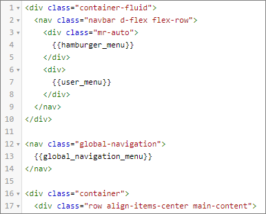
Add the Global Navigation Menu component right after the Top Navigation Bar. With the hamburger menu positioned at the left side of the toolbar, the Navigation Menu will glide just under it when you toggle. Use the nav tags and add the helper class global-navigation. In the next paragraph we will explain why this helper class is needed.
This is the HTML you need to add to the Homepage HTML, right between the HTML for the navigation bar and the div.container:
Xurrent wants to make sure that the Xurrent system is accessible to visually-impaired and blind users. Visually-impaired or blind users access web pages with the help of screen readers. Screen readers parse through the HTML and read the contents out loud, responding to commands to navigate around the page, and take actions such as clicking on a link, typing in an input field, or submitting a form. An important guideline for screen readers to understand a web page is to use semantic HTML. Adivtag has no meaning. Instead, when using thenavtag, a screen reader will understand that it contains navigation info. In order for screen readers to even better interpret the content of web pages, the Web Accessibility Initiative has defined technical specifications in the WAI-ARIA Spec. The ARIA specification adds extra info for screen readers on top of HTML. An example is therole="toolbar"attribute which means: 'A collection of commonly used function buttons or controls represented in compact visual form'. Xurrent is committed to implement these specifications and you will find many ARIA attributes in the standard Self Service design and you can add your own ARIA attributes to the Homepage HTML.
When you click on the hamburger menu, the Global Navigation Menu slides in at the left side of the container.
How it works
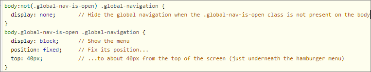
It is important to note that the HTML of the global navigation menu is always present on the page. Xurrent injects only a tiny bit of logic:
- Clicking on the hamburger icon adds the class
global-nav-is-opento thebodyelement.
This is enough to support many scenarios via pure CSS, including a dropdown menu or a menu that is always visible. For example, the following css snippet displays or hides the element with class .global-navigation depending on the presence of body.global-nav-is-open:
The Drop-down Menu
But out-of-the box the global navigation menu is not a ‘proper’ dropdown menu. It opens when you click on the hamburger icon and then stays open until you click on the icon again.
A common wish is to turn the menu into a ‘real’ drop-down menu. You can have a look in other demo accounts to see this working.
Log in to https://widget.4me-demo.com as beatrice.baldwin@widget.com and go to My Inbox. If you click on the hamburger icon, you will see that:
- The dropdown menu appears;
- The rest of the page is slightly darkened (the backdrop);
- When you click outside the menu (on the backdrop), the menu and the backdrop become hidden again.
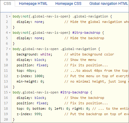
The backdrop is also always present on the page, it is the #itrp-backdrop element. And Xurrent injects again a tiny bit of logic:
- Clicking on the backdrop removes the class
global-nav-is-open.
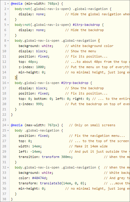
Look at the following CSS. It overwrites the standard Xurrent CSS code to include the backdrop. To make sure the backdrop overlaps the complete body except for the Global Navigation Menu, we use the z-index property. With the z-index you define the stack order of an element on the z-axis: an element with a greater stack order is always in front of an element with a lower stack order. According to this logic we give the the Global Navigation Menu a z-index value of 1000 and the the backdrop a z-index value of 999. And we don’t want the dropdown menu to be stretched to the bottom of the viewport: with the css rule min-height: 0; the dropdown menu will become just long enough to contain all menu items but not any longer.
Question:
Add the css above to the Self Service Design. Will you add this CSS to the Homepage CSS or to the general CSS?
The Global Navigation Menu is also part of the non-homepage forms of the self service. You want to be sure that the behaviour of the Global Navigation Menu is the same, wherever you are in the Self Service Portal. That’s why you will add this css to the general CSS.
Animated Menu on Mobile
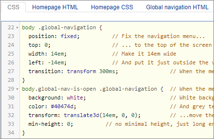
Test the Self Service now on a mobile device. The dropdown is not very attractive on a mobile device. It is more natural for the menu to slide-in from the left-hand side of the screen, when you click on the hamburger menu.
That’s possible with the following CSS that moves the Global Navigation Menu outside and to the left of the viewport and moves it slowly (in 300 milliseconds) to the right when the hamburger menu is toggled.
Exercise:
Add the CSS for the dropdown menu to have the expected behaviour for mobile devices (< 768 pixels)
You need to apply media queries (see exercise 4), so this is the CSS you need:
In a later exercise we will further style the menu.