Styling the Global Navigation Menu
What We Want to Achieve
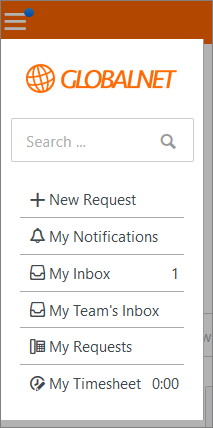
Now we will deal with the global navigation menu. We will make it look like this:
Add the ‘Search’ Bar and Unhide the ‘My Timesheet’ menu link
We removed the search and time spent icons from the navigation bar, but we still want these to be accessible via the global navigation menu.
Exercise:
Add the search bar to the global navigation menu. Make sure it has the placeholder ‘Search’ in the text field.
Modify the Global navigation HTML page, so that it looks like this:

The ‘My Timesheet’ link in the navigation menu is by default hidden on larger screens. Use the Developer Tools to find the styling rule that hides the ‘My Timesheet’ widget. This css rule includes the !important exception, which has a special meaning when defining the CSS Specificity. You will need the !important exception in the following exercise.
Exercise:
Can you make the change to always display the ‘My Timesheet’ link in the Global Navigation Menu, whatever the screen size? Remark: You will need to test this modification with the user Frederic Anderson (frederic.anderson@globalnet.com) because time tracking is not enabled for Red Williams (red.w@ios.com) in the GlobalNet account.
Add the following css snippet to the Self Service Design CSS page, so that it looks like this:

Add the Logo to the Global Navigation Menu
In the Global Navigation Menu the {{brand}} widget is used to render a link to the homepage with the name of the account as the linked text. We want the GlobalNet logo to be displayed instead. This can be done using the basic HTML image and link elements.
Exercises:
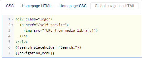
Can you replace the text link with the GlobalNet logo? Wrap the link in a div.logo element with class logo so that it can be styled.
Modify the Global navigation HTML page, so that it looks like this:
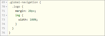
The logo in the nav.global-navigation must be contained within the boundaries of the navigation container and we need some space between the image and the borders (give the div.logo a margin of 20px and the img element a width of 100%).
This is the CSS snippet you need to add to the CSS page:
Styling the Navigation Menu
The Navigation menu needs still some styling. It’s important that when you’re putting together a design layout that you let the elements breath. In the navigation menu, we need to create some white space between the border and the search bar and the menu items. Remember from exercise 5 – Give It Some Space, that’s what margins are meant for.
Exercise:
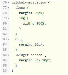
Give the Seach Box a left and right margin of 10 px and create a margin of 20 px around the list of the menu items. Tip: with the Developer Tools you will observe that the menu items are part of an Unordered List.
Modify the CSS so that it looks like this:
Styling the Search Bar
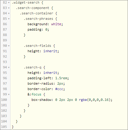
The search bar still doesn’t look good. In fact, we want the big search bar on the homepage and the little one in the dropdown menu to have exactly the same styling. Syling the search bar needs quite a few css rules because it contains multiple elements that all need specific styling. Going into all the details would take us too far in this training. Just add the following CSS to the Self Service Design CSS page and check with the Developer Tools how the different elements from the search bar are styled according to these css rules.
