Give It Some Space
The CSS Box Model
When you have tested the self service design at the end of the previous exercise, you certainly observed that the elements in the center of the page are currently ‘stuck’ together, with no vertical whitespace between them.
To add ‘space’ between content boxes, you need a basic understanding of the CSS Box Model.
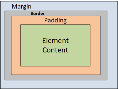
Each box has a border (that is invisible by default). The border goes around the padding and content. The padding is transparent, it clears an area inside the border and around the content. The margin sits between the box and the other boxes. The margin is also transparent and clears an area outside the border.
What Bootstrap has to Offer
Again, the Bootstrap framework makes it easy to manage the spacing according to the CSS Box Model. It offers a complete range of responsive margin and padding helper classes. Have a look at Bootstrap Spacing to get all the details.
The syntax of the spacing helper classes is {property}{sides}-{breakpoint}-{size}.
- With the property prefix, you specify if you want to modify the margin (m) or the padding (p).
- With the sides prefix, you specify at which side you apply the spacing, for example at the top (t), or left side (l). If the side is blank, the spacing will be applied on all 4 sides of the element.
- The breakpoint is optional and can be one of these values:
sm,md,lg, orxl. - The size is a number from 0 to 5 (or the keyword
auto). To get a consistent design and to make life easy for the designer, Bootstrap introduces its own unit for space, the $spacer. Each system making use of Bootstrap can give its own value to $spacer. In Xurrent it has been given the value of 10px (pixels).
Check the Bootstrap Spacing info to calculate the meaning of the size parameter as a ‘number of pixels’ in the Xurrent system:
- 0 = 0 pixels ($spacer * 0)
- 1 = 2,5 pixels ($spacer * .25)
- 2 = 5 pixels ($spacer * .5)
- 3 = 10 pixels (1 $spacer)
- 4 = 15 pixels ($spacer * 1.5)
- 5 = 30 pixels ($spacer * 3)
Exercise:
What will happen if you define the helper class mr-xl-5 on the columns with your card boxes?
They will get a right margin of 30 pixels on extra large viewports (display > 1200 pixels).
Removing Margins and Padding from a Row
In your actual self service design, you will find some horizontal space between the boxes. By default, the Bootstrap grid system adds horizontal padding to the Columns to create the gutters between individual columns. To get full control, it can be better to remove the margin from rows and padding from columns all together (and set your own margins and padding with the helper classes). This can be done by adding the helper class no-gutters on the .row.
Exercise:
Remove the gutters from the row with the 3 cards. Add the maximum margin to the top of the search bar and to the top of the cards. Add the same space between cards. Make sure that there is also vertical whitespace between the cards on very small screens.
A possible solution (you may have found alternative solutions) is the following:
* Add the class mt-5 to the row with the search bar.
* Add the class no-gutters to the row with the cards.
* Add the class mt-5 to all 3 card boxes to give them a top marging of 30 pixels.
* Add the class mr-sm-5 to the left card box to give it a right margin of 30 pixels, except for extra small devices.
* Add the class ml-sm-5 to the right card box to give it a left margin of 30 pixels, except for extra small devices.
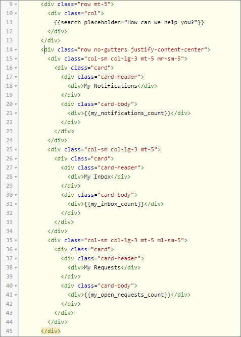
This is what the Homepage HTML will look like:
Understanding the CSS Display property – Centering the GlobalNet Logo
Now we need to center the GlobalNet logo horizontally. Or, phrased differently: we want the left and right margin of the image element to be equal. The way to do that is to set the left and right margin to ‘auto’. That’s an easy one, the Bootstrap framework includes the wonderful helper class mx-auto to do so.
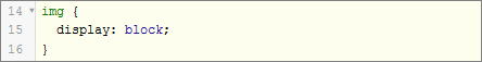
But adding the mx-auto to the img element is not enough. You need to consider the CSS display property. This is one of the most important parts of webpage’s layout design and styling. It determines how the elements will appear.
HTML elements can be split into two major categories: Block elements and Inline elements. Block-like elements (div, p, h1, etc.) always stretch out as far to the sides as possible and start in a new line.
Meanwhile, Inline elements (span, img, a, etc.) only take the space that is necessary and don’t have to start in a new line. Since these elements are quite different the way to display them should be adjusted accordingly. You cannot manipulate the height and width of an Inline element. Also, the top & bottom CSS paddings and CSS margins are not respected with the display: inline; css property in place. But with the display: block; css property you can turn your inline element in a block element.
Exercise:
Center the GlobalNet logo horizontally on the homepage.
Modify the Homepage HTML as follows:

and add the following lines to the Homepage CSS: