Cards
The final part of the main content are the three boxes below the search bar. We will add them next.
What We Want to Achieve
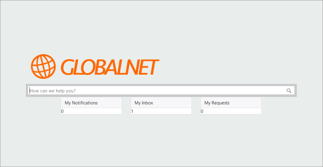
On a small or medium screen, the three boxes should be as wide as the search bar:
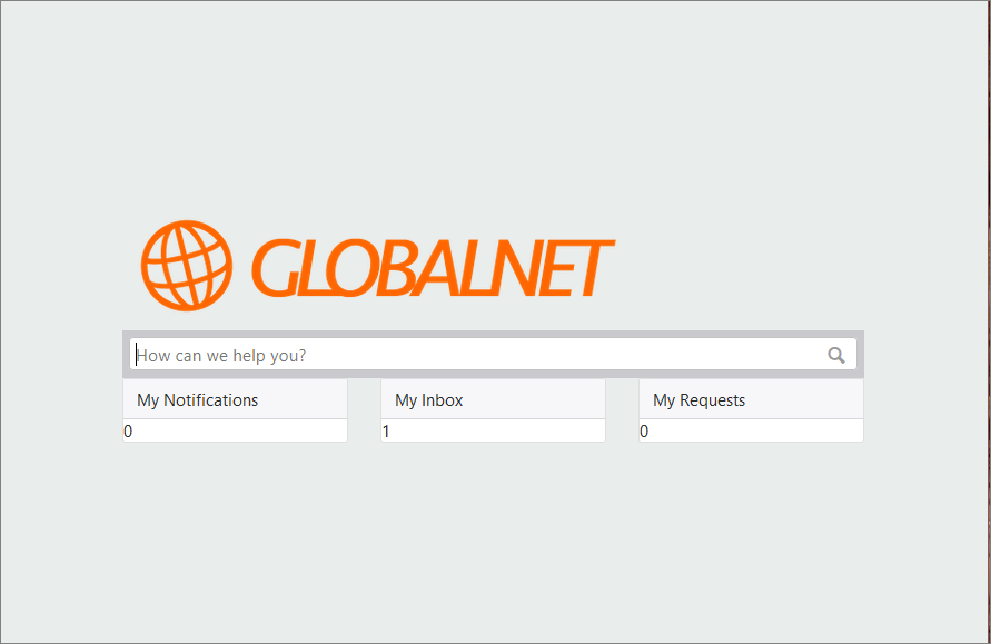
On a large screen, the three boxes should be a little smaller than the search bar, like this:
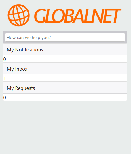
On a very small screen, the three boxes should be stacked on top of each other:
The Counters
At the start of this training you have learned that there are a number of handy widgets available for adding content.
In this exercise you will use widgets to get the counters in the boxes.
Exercise:
Can you identify the 3 widgets we need for the counters in the boxes? Type {{ in the Homepage HTML page to get the list of all available widgets.
You can use the following widgets for the counters in the boxes:
1) my_notifications_count: the number of new notifications for the current user
2) my_inbox_count: the number of unread items in the inbox of the current user
3) my_open_requests_count: The number of open requests submitted by or for the current user
Adding the Boxes
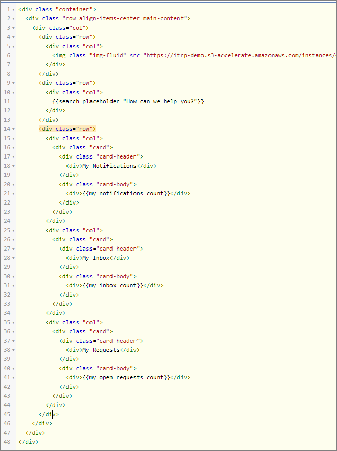
We will use the Bootstrap Card component for the boxes. A card is a flexible and extensible content container that offers easy alignment and mixes well with other Bootstrap components. A Bootstrap card consists of multiple parts that can get their own styling. In this exercise we will use two building blocks, the .card-header for the title and the .card-body for the counter. Using these building blocks, the HTML for a card will look like this one:
  <div class="card">
    <div class="card-header">
      <div>Title</div>
    </div>
    <div class="card-body">
      <div>Counter</div>
    </div>
  </div>
Exercise:
Add the HTML code to the HTML Homepage tab to add the 3 boxes. Each box will need his own card, and each card needs its own column.
You need to add an extra content row with 3 columns to the Homepage HTML:
The Second Requirement
Check the new HTML code for different screen sizes: whatever the screensize, the three boxes are as wide as the search bar. But the second requirement says: On a large screen, the three boxes should be a little smaller than the search bar.
For now, do not worry about the distinction between different screen sizes. We will first focus on making the boxes a little less wide than the search bar. This can be done by yet another helper class from the Bootstrap grid system. The Bootstrap grid system allows for a maximum of 12 columns or 12 units in a row. With the Column classes you can indicate the number of columns you’d like to use out of the possible 12 per row. So, if you want three equal-width columns across, you can use .col-4. If you would use three equal-width columns with the following helper class .col-2, the three equal-width columns will only use 6 out of 12 available units. And without any other helper class, these three columns will be left aligned in the row.
Now take a look at the diagram in Grid System Horizontal Alignment.
Exercise:
Taking inspiration from that diagram and the HTML below it, what are the correct helper classes you need for the row and for each column to make the three boxes a litlle smaller than the search bar?
For the row you need justify-content-center: this will make sure your columns are centered along the row.
For the columns you can use col-3: your columns will only use 9 out of 12 units leaving some space at the left and right side.
Putting it All Together: Setting Breakpoints
In Exercise 1, we explained that you will use a technique called responsive design to make sure that the same design looks good both on desktop and on mobile devices. In Exercise 2, we introduced a first example of responsive design, showing a row with three col-sm columns. This had the effect that the three columns become stacked on very small screens.
In fact, the suffix -sm used in exercise 2 is a Breakpoint. For grids that are the same from the smallest of devices to the largest, you will use the class .col without a suffix. By applying the class .col-sm, the grid becomes active only when the viewport is larger than 576 pixels, meaning the grid will not be applied on extra small devices where the content will be stacked. Grid breakpoints are based on minimum width, meaning they apply to that one breakpoint and all those above it.
Look at the Grid Breakpoint Options Table to understand the 5 predefined breakpoints in the grid system:
- xs – Extra Small
- sm – Small
- md – Medium
- lg – Large
- xl – Extra Large
The next challenge is to implement multiple requirements at the same time, in this case:
- Stacked on very small screens
- Three columns taking up 100% width on small and medium screens
- Three columns centered and about 75% width on large screens
To do so, you need to mix and match multiple helper classes. Take a look here to see some of the things you can do.
Exercise:
According to the Grid Breakpoint Options Table, what are the the helper classes you will apply to meet the 3 requirements? Modify your HTML code and test your self service design for different viewport sizes.
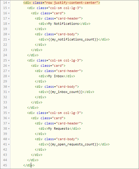
For the ‘Stacked on very small screens’ and the ‘Three columns taking up 100% width on small and medium screens’ requirements, you can use the col-sm class and for the ‘Three columns centered and about 75% width on large screens’ requirement, you can use the col-lg-3 class. Modify the Homepage HTML as follows: