The Logo
As our next step, we’ll add the logo.
What we want to achieve
We put the logo directly above the search bar, also vertically centered on the page. Like the search bar, it should resize according to the width of the browser window.
Upload the logo to the Media Library
First, log in to https://globalnet.4me-demo.com as frederic.anderson@globalnet.com and go to the Media Library. Create a new Media File and upload the following image:
Another row in the grid
In the Bootstrap Grid System content must be placed within columns and only columns may be immediate children of rows. In this step we will add another content element, which needs a row and a column on its own. So we will define a seperate row and column for the logo and another row and column for the search bar and wrap both rows in the main-content row and column. We will use the img tag) to add the logo.
Exercise:
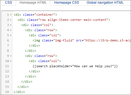
Add the logo to the container as another row with a single column. Don’t worry about the size of the image just yet.
The Homepage HTML tab should now contain the following (the link to the image must be the public link to the GlobalNet logo in the media libarary of your environment!):
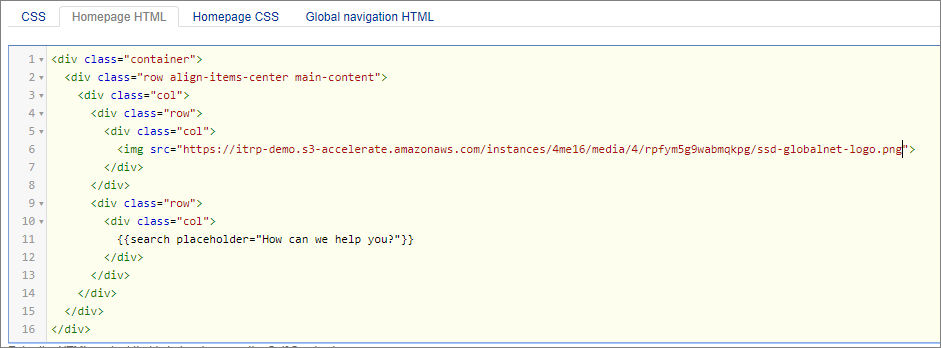
Image size
Check the results at https://globalnet.4me-demo.com/self-service and resize your browser window. Unfortunately, the image does not resize when you make the browser window smaller than the logo. In other words, it is not responsive.
Bootstrap provides a helper class that you can add to the <img> tag to make it responsive, as defined in the Bootstrap Image component.
Exercise:
Go on and make the appropriate change to make the GlobalNet logo reponsive.
Add the img-fluid class to the <img> tag, as follows: