First Steps: The Search Bar
Enough theory, let’s get started!
We will start with a clean slate and build the design from the ground up.
What we want to achieve
The first step will be to insert the search bar in the middle of the page, like this:
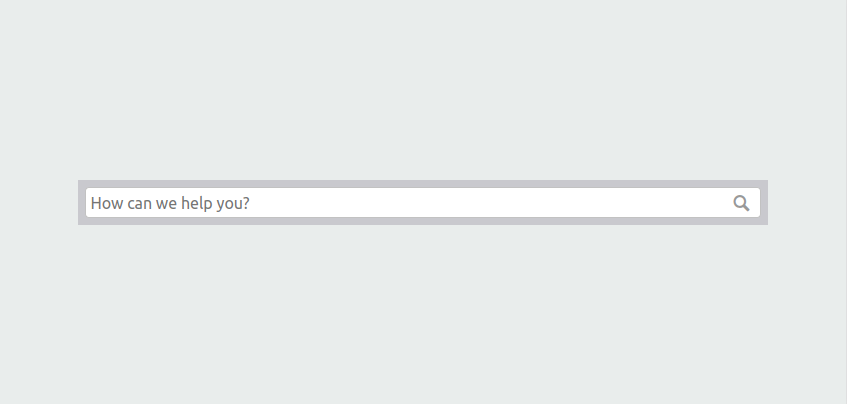
We would like the search bar to be both horizontally and vertically centered.
Its size should depend on the size of the browser window, and be neither too big nor too small. On a large desktop screen, it should not be too big and have quite some space on the left and right. On a mobile device, the search bar should be the entire width of the screen.
Bootstrap can help us with this.
A horizontally centered search bar
Log in to https://globalnet.4me-demo.com as frederic.anderson@globalnet.com and go to the Self Service Design. Clear out the Homepage HTML tab and replace it with a single div:
<div>
</div>
Save the result.
In another browser (window), go to https://globalnet.4me-demo.com/self-service and you will be greeted with a blank page…
For the following exercise have a look at Bootstrap Grid Containers and Bootstrap Grid System for inspiration.
Exercise:
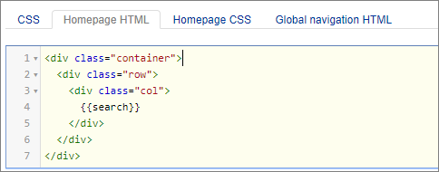
By using a Bootstrap container and a row consisting of a single column, can you add the search widget, so that it is horizontally centered at the top of the page?

Add the following HTML to the Homepage HTML tab:
Vertical centering
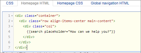
Vertical centering means that the space above and below the content is exactly the same. We can achieve this using Bootstrap and applying the appropriate Bootstrap Grid Vertical Alignment Classes:
<div class="container">
  <div class="row align-items-center main-content">
    <div class="col">
      ...
    </div>
  </div>
</div>
Add the Bootsrap classes to the Homepage HTML tab and save the design.
But when you look at the results at https://globalnet.4me-demo.com/self-service, you will not see any difference yet. We need to define the size of the viewport. The viewport is the user’s visible area of a web page. The viewport is an important concept in responsive design: it varies with the device, and will be smaller on a mobile phone than on a computer screen. But it’s up to you to define how the contents of the web page fit into the viewport. For now, the height of the row with the content is equal to the height of the content (the lonely search bar).
Height
So let’s define the height of the container that contains the main content. We’ve already defined the class main-content. We will make sure that this container equals to the height of the browser window (the viewport). As you’d expect, you can use the height CSS property to do so. But which value should this property get? Take a moment to look at the units listed at CSS Units – w3schools.
Exercise:
What is the appropriate CSS rule to make sure the height of our main content equals to the viewport?
The vh unit is the most concise way to express what we want. 1vh is equal to 1% of the viewport, so we want the box height to be 100vh. Add the following CSS to the Homepage CSS tab of the Self Service Design.
  .main-content {
    height: 100vh;
  }
Placeholder
The search bar is blank by default, but you can add a placeholder text to it that is displayed when the user has not yet entered any text.
Modify the HTML as follows:
Save the design and check the results in the Self Service portal. It should now look like the screenshot at the top of this page.