Styling the Cards
We still need to style the cards and make sure they link to the right content.
What we want to achieve
For the cards, we will implement the following requirements:
- Center the text in the cards
- A large icon should be displayed in the card header
- The cards should link to the appropriate page in Self Service
- The card should ‘light up’ when you hover the mouse over it
- The counter in the card body should be highlighted in blue when it is larger than 0
This will transform the cards from this:

to this:

Initial Style
First add the following CSS to the Homepage CSS field:
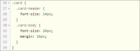
By now, you should know how this will change the styling of the cards.
Center the Text in the Cards
We will start by centering the text in the cards. You have the choice now to use the standard css text-align property or to use the Bootstrap Text Utility.Exercise:
Implement one of the alternatives. Which method do you prefer?
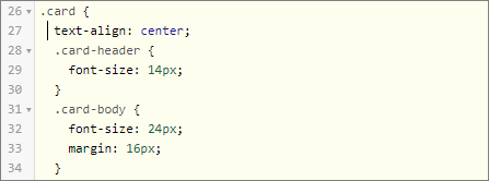
Using standard css, you will modify the Homepage CSS:
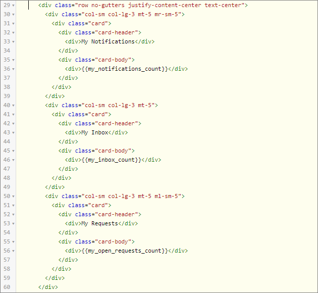
Using the Bootstrap Text Utility, you will add the text-center class to the row containing the cards in the Homepage HTML:
We prefer the Bootstrap solution, because it allows you to make text formatting responsive, e.g. text-sm-center will only center the text on viewports sized SM (small) or wider.
Adding the Icons
Throughout the Xurrent application, an icon font is used to display icons. An icon font is just like a regular font (such as Arial or Times New Roman), only it contains icons instead of letters. Icon fonts have several advantages over using images, some of which are:- The icons in an icon font look nice and sharp, regardless of their size
- You can change their color and other attributes using CSS (no need for a different image per color)
<i class="ii icon-inbox"></i>
Exercise:
You want the icons to be displayed in the card headers on top of the actual text messages (‘My Notifications’, My Inbox’ and ‘My Requests’). Search for a convenient icon in the “Xurrent icon library” and modify the Homepage HTML. The icons need to be large enough: we will need a font size of 36px. Modify the Homepage CSS to set the font size of the icons.
Modify the card elements in the Homepage HTML:
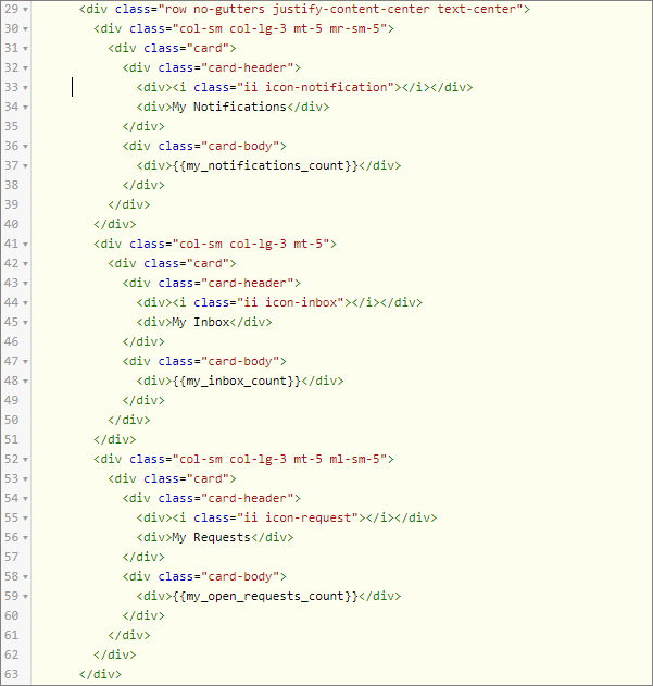
And modify the Homepage CSS:
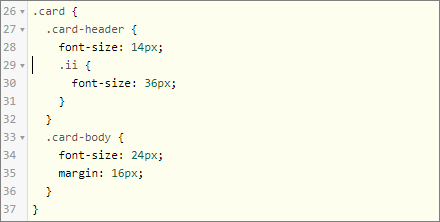
A font is a collection of characters. The font in the Xurrent system is called ‘itrp-icons’. itrp is the technical name of the Xurrent system (it still refers to the original branding that was used when the Xurrent system was built). Each character (and in this case each icon) has a unique number or identifier within the font.
To fully understand how this works, open the Self Service Portal and inspect the Inbox icon.The relevant parts of the CSS look like this:
The
:beforepart of the second rule is called a pseudo-element. It is used to insert some content inside the element with the class icon-inbox. In this case, we insert the 58112th character of the itrp-icons font, which happens to look like an inbox.
Link the Cards
The user will expect to open the Inbox when she clicks on the Inbox Card. So we need to turn the entire card into a link, so that clicking anywhere on the card brings you to the correct self service page. In HTML this means that we need to turn thediv.card elements in a.card elements according to the HTML Links syntax.
Exercise:
By using the options in the hamburger menu, you are able to identify the following links:
1. My Inbox: https://globalnet.4me-demo.com/self-service/inbox
2. My Requests: https://globalnet.4me-demo.com/self-service/requests
3. My Notifications: https://globalnet.4me-demo.com/self-service/notifications
Turn the cards on the homepage now in clickable links.
Modify the card elements in the Homepage HTML:
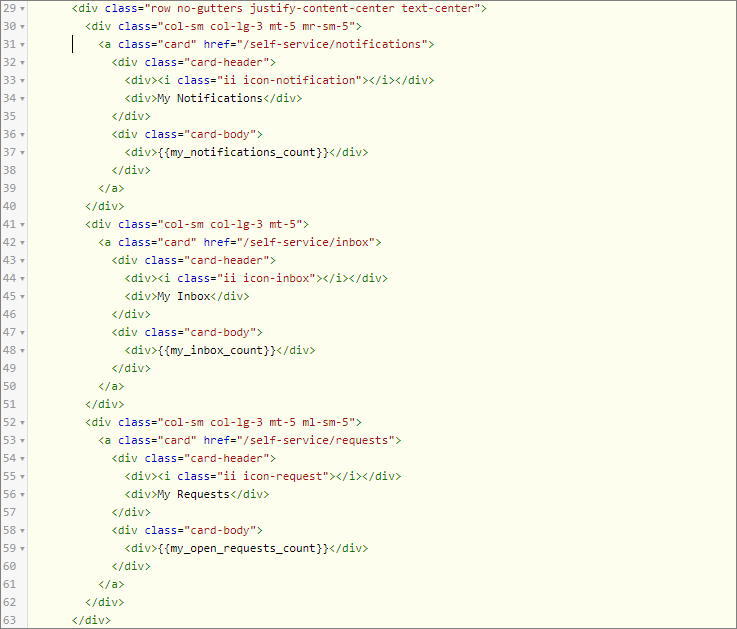
<a .>... </a> elements. To have our grey color again, you will need to apply CSS rules for the color and border-color properties of the cards. But you must take into account CSS Specificity, the algorithm by which browsers decide which CSS property values are the most relevant to an element and, therefore, will be applied. The basic principle is that by indicating one or more elements before the element you’re selecting, the rule becomes more specific and gets higher priority.
Exercise:
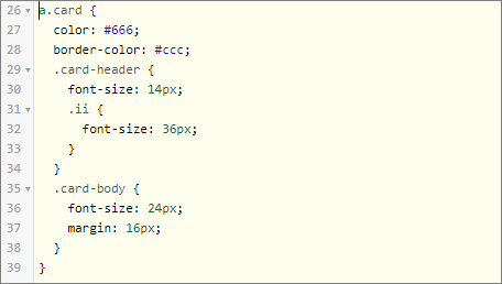
Set a dark grey color for the text and icons (color code #666) and a light grey color for the color of the borders (color code #ccc) of the cards.
Adjust the card CSS from this:

to this:
Highlight on Hover
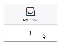
Next, when you hover over the cards with the mouse,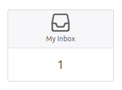
we want it to turn into this:
We can make use of the CSS Pseudo-classes. A pseudo-class is used to specify a special state of an element and based on that state, style it. It can be used to:
- Change the color of this element when the mouse is hovered over it
- Change the shadow effect when the cursor is in this input field
- Change the background of this button when the mouse is pressed down on it
selector:pseudo-class {
property:value;
}
The
hover pseudo-class is one of the available pseudo-classes. To set the background color of a div element in blue when you hover over it, you can style it with:
div:hover {
background-color: blue;
}
Exercise:
When the mouse is hovered over a card, its border should turn to the color #999 and all the text in it (including the icons) should turn to the color #333. Implement this by making use of the :hover pseudo-class.
Add this css snippet to the Homepage CSS:

Highlight Counts Higher than 0
Finally, we want to highlight counts higher than 0, by making the number blue and bold: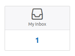
How could we do this? It seems we have to apply a CSS rule based on the text inside a HTML element: If the text is not 0, make it blue and bold. Unfortunately this is not possible with CSS: CSS is based on HTML elements and classes. Could we somehow encode the necessary information in the class attribute?
This is indeed possible: the text that displays the counter inside the card body is rendered with a widget. We could use the same widget to build our own class attribute
count-. For the Inbox card this would become:
For the css rule to be only applied when the counter is not zero, we can use the CSS ‘:not’ Selector.
Exercise:
Apply the technique outlined above to style the counters:
1. If the class is count-0, the text should be the normal color and normal font size
2. Otherwise, the text should be blue (#1b75bc) and bold (use the font-weight CSS property for this)
Modify the card elements in the Homepage HTML:
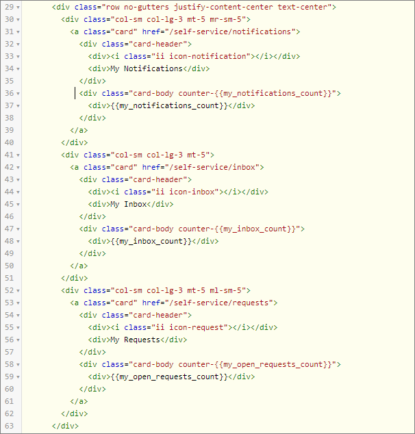
And this is the css snippet to style when the counter is not zero:

