Styling other Self Service Pages
In this exercise we will restyle all the other (‘non-homepage’) pages of the Self Service.
You have been given the following requirements:
- The navigation bar in the top header has the same orange color as the orange color from the GlobalNet logo. But only the inner part is 0px. The outer parts are white and are one with the white background (no borders, no shadow);
- The Hamburger menu in the top header bar is white, which gives a nice contrast with the orange color;
- The ‘Search bar’ and the ‘Time spent today’ widgets are removed from the navigation bar;
- The content container has a small grey border without any shadow;
Get the Orange Color Code from the Logo
We need the color code of the orange color of the GlobalNet logo. This color code can be retrieved with the Developer tools. In Chrome, log in to GlobalNet as frederic.anderson@globalnet.com and go to the Homepage. Use the Element Inspector and select the body element from the elements console. In the styling window you should find somewhere thebackground-color: white rule.
 You will notice a small white box next to the background color: click on this box to open the color picker.
Next, hover the mouse over the orange ‘N E T’ characters in the GlobalNet logo. You will see a close-up of the individual pixels. Click on one of the orange pixels. You should see that the color of the background is changed into this orange color with the color code of the orange replacing the ‘white’ color:
 #ff6600.This is great: you can just pickup the right color and immediately apply it and check how this would look like as a background color (it’s ugly, but we will keep the color code to modify the navigation bar in this exercise).
Inspect the Structure of the Navigation Bar of the Inbox
The navigation bar is available on all other pages of the Self Service. So, let’s use the Developer Tools to check how the navigation bar is build.
Question:
Describe the HTML structure of the navigation bar in the top header bar of the inbox view of the Self Service.

The navigation bar element div.global-header is contained within a div.global-header-inner-container, which is itself contained within a div.global-header-outer-container.
Using the Developer Tools to Test a New Styling
You have learned now how you can use the color picker of the Developer Tools to modify the color of an element. With the same technique, you will now simulate a new styling for the navigation bar in the top header. Select thediv.global-header-outer-container and check the styling. You will find rules for setting the background and the box-shadow. Doubleclick on the value to the right of the background attribute and overwrite with the value white. Check the result. Overwrite the value of the box-shadow with none.
 You cannot only simulate the modification of a rule with the Developer Tools, you can even add a new rule.
Select the
 div.global-header-inner-container with the element inspector. At the top right corner of the Styling combo box, you will find a “Plus” sign, when you hover over it it reads ‘New style rule’. Click on the ‘New style rule’, click on the TAB key and enter the background attribute, click on the TAB key again and enter the value #ff6600. Check the result: the inner part of the navigation bar is in orange now.
For the following exercise check the visibility CSS property.
Exercise:
Use the Developer Tools to hide the ‘Search’ and the ‘Time spent’ widgets in the navigation bar.
Add visibility: hidden for the .global_search_link.header-button and the .widget-time-spent-today.header-button elements.

Xurrent Supports SCSS
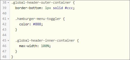
Have a look at the following css snippet:

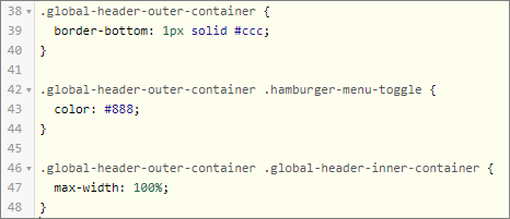
This is very useful for showing which rules belong together, but it is not proper CSS. The browser does not understand this, and needs the rules about the .global-header-outer-container to be written like this:

Because we feel that the latter is much harder to read and write than the former, all CSS fields in Xurrent may contain SCSS, which is a ‘dialect’ of CSS that adds some useful extensions to the language, such as nesting and the use of variables. SCSS stands for Sassy CSS and you can find some more info here. When you use SCSS syntax, it is translated to proper CSS before it is served to the browser.
Let’s Make it Work
Now it’s up to you …
Exercise:
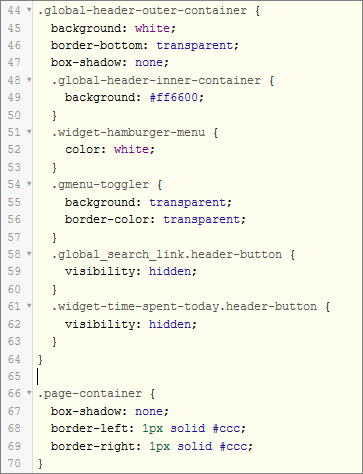
You have now all the info to write the CSS to style the other pages of the Self Service according to these requirements:
1) The navigation bar in the top header has the same orange colour as the orange colour from the GlobalNet logo. But only the inner part is orange. The outer parts are white and are one with the white background (no borders, no shadow);
2) The Hamburger menu in the top header bar is white, which gives a nice contrast with the orange color;
3) The ‘Search bar’ and the ‘Time spent today’ are removed from the navigation bar;
4) The content container (div.page-container has a small grey border without any shadow.
This is the CSS you need to add to the CSS tab of the Self Service Design:

