Structure of the Self Service Portal
Before we dive in, let us first get familiar with how the 4me Self Service portal is structured. Go to the browser where you are logged in as the end user Red Williams (red.w@ios.com). You are now on the Self Service homepage.
Open the hamburger menu and click on My Requests. A list of the requests submitted by Red Williams appears (in this case, there is only one).
Now click on New Request. Select the ‘Internet Access’ service and on the next screen select the standard request ‘Addition of domain to the domain blacklist’. A simple form appears.
This is Self Service as it looks out of the box, without any customization. It is intentionally kept very basic, as we expect that most customers will want to adjust the design to the look and feel of their own company.
For the purposes of design, the pages on Self Service can be divided in two groups:
- The Homepage: this page can be fully customized. You can replace both the HTML and CSS with your own.
- All the other pages, such as the My Requests page and the pages of the New Request wizard. On these pages you can also fully customize the CSS, but you cannot change the HTML.
The Self Service Design Form
Let us see how this is accomplished.
Go to the browser where you are logged in as the account designer Frederic Anderson (frederic.anderson@globalnet.com). Go to the settings console and select the option Self Service Design.
On this page, you can see 4 tabs:
- CSS
- Homepage HTML
- Homepage CSS
- Global Navigation HTML
Together, these 4 tabs can be used to customize both the homepage and the other pages of Self Service. They work together as described below.
Homepage
HTML
The HTML of the Self Service homepage is built up as follows:
  <head>
    Inserted by 4me
  </head>
  <body>
    Value of the Homepage HTML tab
  </body>
That means that, apart from the head part of the HTML (which is not shown by the browser, but contains information about the page), you can create any HTML you like.
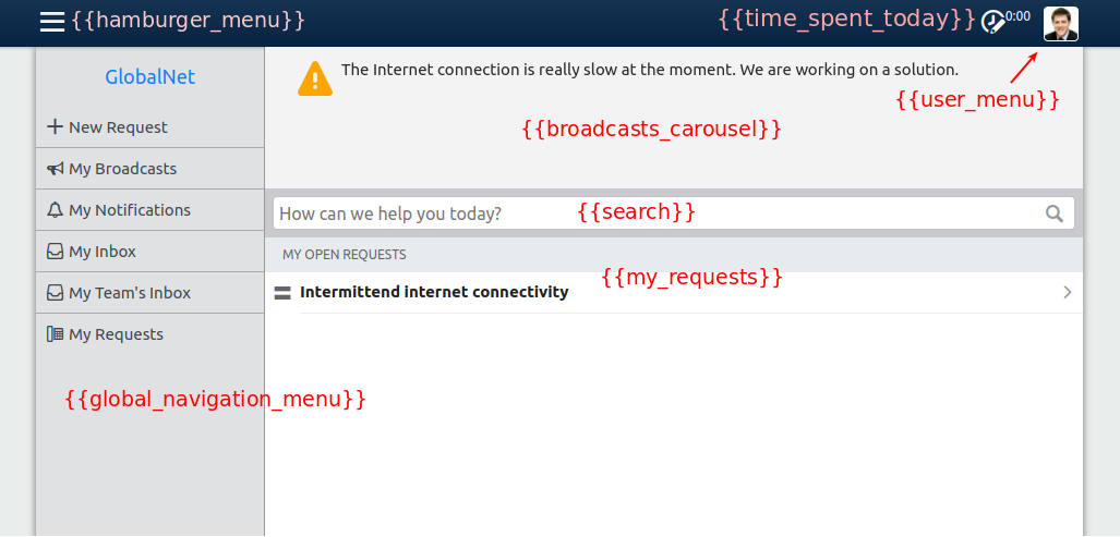
It is possible to include widgets on the homepage by adding {{name of the widget}} at the desired location in the Homepage HTML. Widgets are standard components offered by 4me that can be used to display dynamic content (e.g., content that depends on the currently logged in user).
When a user visits Self Service, the widgets will be replaced by HTML.
{{brand}} is an example of a widget. For GlobalNet, this widget renders the following HTML:
<div class="widget-brand">
  <a class="brand" href="/self-service">GlobalNet</a>
</div>
When you put the cursor in the Homepage HTML tab and type {{ a list of available widgets appears.
The out-of-the-box design contains the following widgets:
CSS
The CSS of the homepage is built up as follows:
- CSS of Bootstrap (more on that later)
- Standard 4me CSS, used to style standard widgets that may occur on the homepage, such as the search bar and the user menu.
- CSS of the CSS tab of the Self Service Design
- CSS of the Homepage CSS tab of the Self Service Design
Other Self Service pages
HTML
It is not possible to customize the HTML of the other Self Service pages, with the exception of the global navigation menu. This is the menu that is displayed when you click on the hamburger menu icon in the top left corner. By default, it contains only the following widgets:
{{brand}}: the Account name, linking to the Self Service homepage{{navigation_menu}}: a list of links to all the pages of Self Service
You can adjust the Global Navigation HTML tab of the Self Service Design to also include other elements, such as custom links.
The global navigation menu can also be included on the homepage. If you add the {{global_navigation_menu}} widget to the Homepage HTML tab, the HTML of the Global Navigation HTML tab is inserted at the appropriate location.
CSS
The CSS of the other Self Service pages is built up as follows:
- CSS of Bootstrap
- Standard 4me CSS
- CSS of the CSS tab of the Self Service Design
As you can see, the CSS tab of the Self Service Design is injected both on the homepage and on all the other pages. You should use it to customize components that occur on both, such as the Global Navigation Menu.
Mobile devices and responsive design
When you log in using a mobile device, the same Self Service Design is shown as on a desktop. That means you have to make sure that the same design looks good both on desktop and on mobile devices.
You can do this by using a technique called responsive design. The word responsive refers to the fact that the design ‘responds’ to different screen sizes, for example by displaying content in a row on a large screen and in a column on a small screen.
We will work through some examples later.